Oppaira's JAV Studio Logo Tier List - Part 1
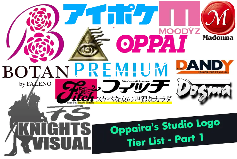
Hey guys, Oppaira here. I thought it would be fun to rank a bunch of studio logos so here we are. I'm calling it part 1 as there are a lot of studios, more than I think is feasible for a single post. Maybe another time I'll go and grab a few more, as there are plenty of recognizable names I left off the list. For now though, I hope you enjoy me praising and ranting about some logos.
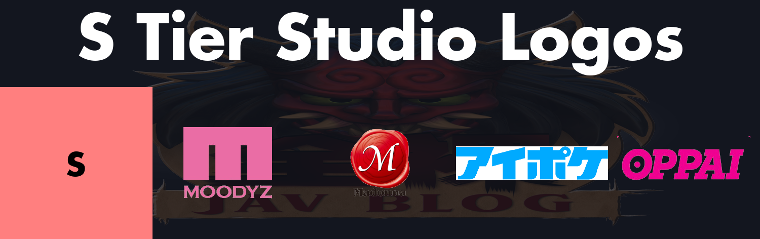
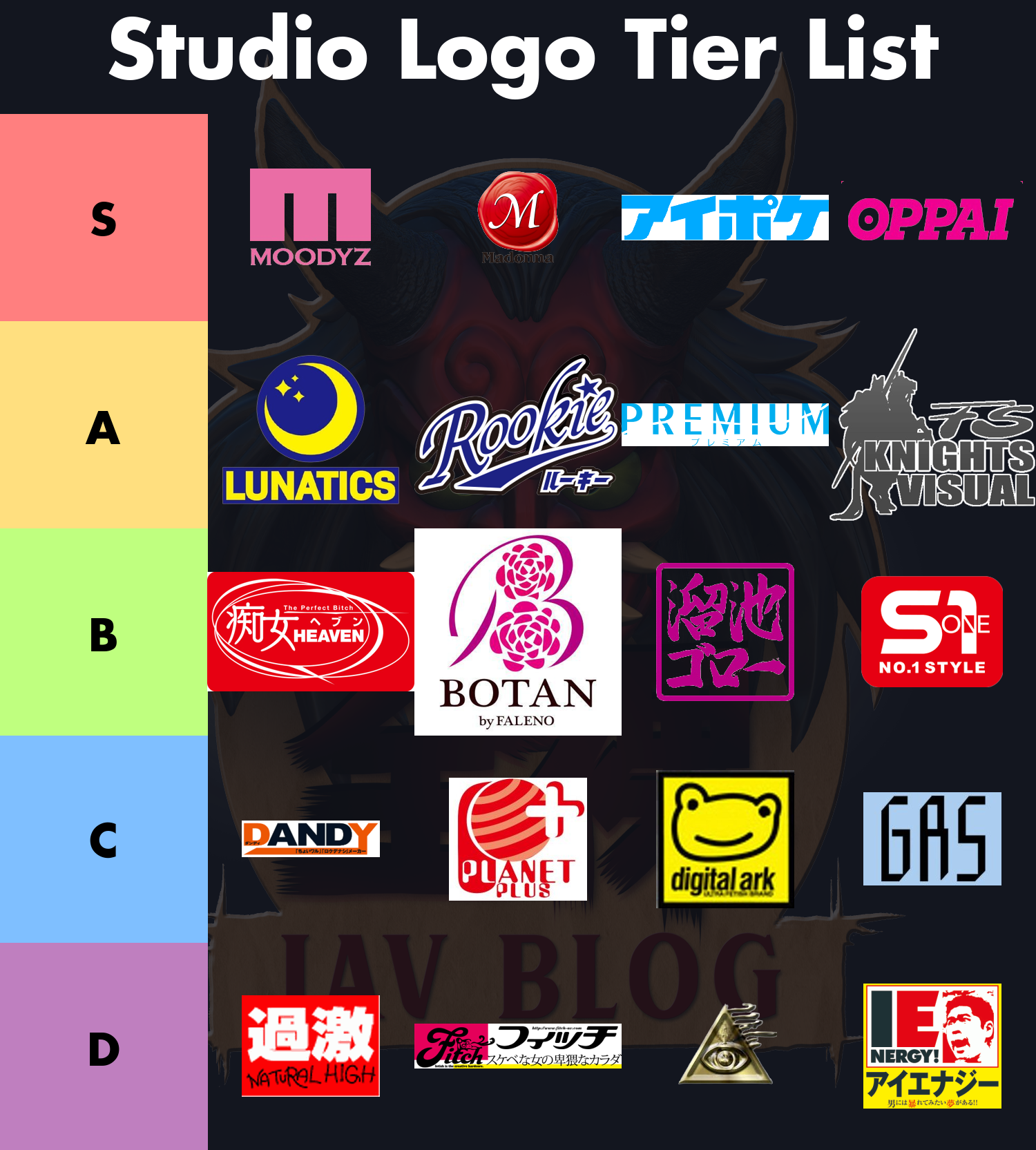
Moodyz
I like the simplicity of the Moodyz M with the name underneath. It’s unmistakable when it’s just the simple and clear logo like that, and M is a good letter that allows for a blocky style like this to work.
Madonna
Madonna’s is absolutely fantastic. It looks like a waxed on seal that gives it this premium feeling, and the font choice for the M feels exquisite as well. It’s also often stylized quite small which I appreciate since it can be placed out of the way. Like the Moodyz one, I don’t mind the text underneath saying Madonna, especially if it’s in a font that can fade into a background easily.
Idea Pocket
If you do read Japanese it says Aipoke which is obviously meant to be an abbreviation of the full name. Considering how long it would need to be to do be the full name, that abbreviation is much appreciated. I like the colour, I like the blocky style, and I just generally appreciate the simplicity. Especially in more recent stuff where they brand their preview images with IDEAPOCKET, this is so much better.
Oppai
I have always loved how clever Oppai’s has been with the dot in the O making it resemble a huge boob. It’s just such a clean way to give you something more than just the text while giving it some flair of its own.
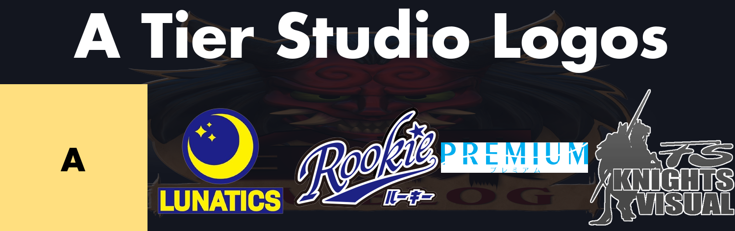
Lunatics
This is the trimmed down version that they tend to use in their screenshots. I feel like this drew inspiration from Luna from Sailor Moon, especially when you see the full one with a cat on it and realize even the colour scheme here matches Luna. Anyway, it’s a pretty simple logo that gives you something easily identifiable without being too busy. You don’t really need to think about what the logo is and you’ll remember the moon.
Rookie
I like how simple the logo looks and I feel like it could be used as a baseball team patch. The white around the text feels a little bit too big to me, and the need for Japanese text feels a bit off. It’s still a great logo but I think sticking to one language to make it a little bit cleaner would potentially elevate it to S tier.
Premium
Just like Rookie’s I feel like this one doesn’t need the text underneath. I like the text and I like the line through it as it feels a little more unique for something that is otherwise very simple. It does feel like it’s missing a little something to elevate it though, especially with how wide and narrow it is.
Knights Visual
I quite enjoy the idea of a knight the way they’ve positioned it. The silhouette form like this is something cool that doesn’t feel too busy, especially compared to other versions of the logo with the explosion background or the distracting white sun in the background. The gray isn’t exactly great though as the contrast between that and the white isn’t high enough, especially in the center of it. I also think that having to spell out the whole thing of FS Knights Visual feels a bit too busy, and a trimmed logo saying just KV would probably be a lot better.

Notify Me of New Blog Posts
Get notified when we publish new blog posts:
Chijou Heaven
The logo feels a bit busy at times to me with how much is actually in the logo. There’s Japanese text, there’s English text, there’s even a slogan if you can see it in there the perfect bitch which is in English. The mix and match feels a bit lacking to me. I often call them Slut Heaven myself as a better English translation of it, even if the word 痴女 (chijou) translates a little bit differently, as I feel like slut more accurately emphasizes what they try to do. I like the swirls around it, feels like someone circled it a couple of times with a pen to really emphasize it. And really, at least the slogan is very short compared to some, and it does fit decently cleanly into the logo.
Botan
I’m just going to say that if you need to include by Faleno then your studio kinda sucks. The logo itself isn’t half bad, even if there’s a lot going on. Botan does often use a transparent background, I’ve left it white here just because it’s easier to actually see the text on it. The flower petals do give the B an interesting flair and I feel like it has a lot of potential, it just doesn’t quite feel clean enough to me. Maybe there’s too many petals, maybe it’s just chunkier than it needs to be.
Tameike Goro
Goro-san’s logo has always felt middle of the road to me. I like that it actually feels like a good way to put the logo together, as if it resembles a hanko. It’s relatively clean, though I think the slightly sloppy text does feel a bit sloppy in some parts where it could have been slightly cleaner.
S1
S1’s newly minted logo doesn’t excite me. I keep getting hung up on the fact they keep promoting the whole “no.1 style” bit even though I think it’s completely unnecessary at this point. Nobody goes around saying that bit, it’s always just S1. They’re such an established brand that trying to push a pointless catch phrase is pointless. Especially in the logo, what’s the point? Compared to Madonna, who has a version of the logo with and without the phrase and is kind enough to use the trimmed logo where it makes sense, S1 always uses this logo, even in the watermark in videos. I do think the newer version is a little bit nicer than the old one in terms of picking a more modern font (the old font feels antiquated), but I might have picked a font that still makes the 1 look like a 1 a little more. Even with the logo I think it’s decently clean and it’s not the eye sore that some are.
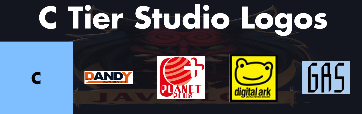
Dandy
I’m not quite sure what Dandy was thinking when they stylized it D AND Y with their colour scheme. Maybe AND is supposed to represent the multiple actresses in a sort of A and B and C and D and Y sort of deal. I find it a bit awkward that they often will change the colour scheme of it, and I’ve seen them use other schemes like pink/white, teal/white, gray/white, etc. It’s a bit clever to put the text in the lengthy styled Y but it also feels very busy, like I want to go and read it even though it’s not particularly useful text. Did they really need to write メーカー (maker) at the end? Doubtful.
Planet Plus
I don’t hate it but I don’t love it. It’s a logo you can definitely recognize from the planet icon alone and them trying to style it so it looks like P+ feels a bit too busy. The wording on the text is a bit hard to read and I honestly don’t like them having to change the font colour to make it work with the red background from the placement, nor do I like how much bigger planet is. It’s not a dumpster fire but it could definitely have had some more iterations to find a better compromise.
Digital Ark
Part of me loves the goofy frog (at least I’m calling it a frog and there’s nothing you can do to stop me) that it has but part of me thinks it was drawn as a joke. Like someone doodled this in their notebook at work and they just sort of ran with it. The text underneath is hard to read with how small it is relative as well. There’s something to be said about how simple the frog is though, and the fact you could doodle the logo yourself is a bit appealing.
Cinema Unit Gas
Gas, or their full name Cinema Unit Gas, has a pretty mediocre logo. It’s not a train wreck the way I think some of them are but it’s not great. I really don’t like the font style and it feels quite big for what it is, making it honestly a little hard to read.
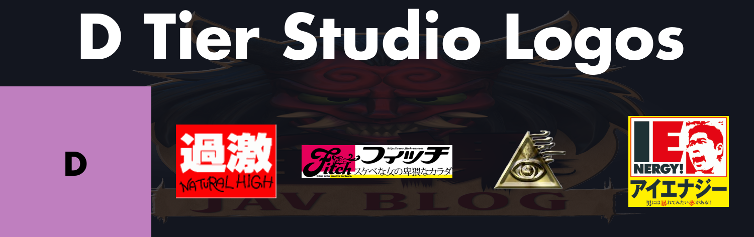
Natural High
This logo looks like a hot mess. I find the white on red a little bit difficult to read given how busy the kanji is in this particular font. I also really dislike the way the English is written, looks like someone just scratched it on really quickly. To Japanese I bet it doesn’t matter so much but to me it just looks like some exec was like “hey we have a couple of English viewers, go make it work for them”. Really not doing anything for me.
Fitch
Fitch’s logo feels way too busy for me. From this sizing you can’t even tell that there’s actually a woman drawn on top of the itch portion of it. It’s got the text written on multiple different backgrounds that takes a second for you to wrap your head around. The white parts are actually transparent on the live logo but I left them like that because you wouldn’t be able to see the text otherwise. Not that you’re going to read a whole sentence in the logo (neither the Japanese nor English sentence) or the studio’s URL in the logo. I always hate it when they do that with the URL in there, like why? The one they use in screenshots is a little bit simplified but it still feels very busy.
Milu
Milu’s logo looks like some school art project gone wrong. Is it supposed to be the Millenium Puzzle? Are we watching National Treasure? I simply don’t like using Egyptian mythology here, what are they even doing? Maybe the logo came from Milu → Millenium → Millenium Puzzle, but really that’s kind of tacky in my mind. The blob on the side is actually Milu written out (sorry for the lower quality image!) but it still isn’t impressive.
IEnergy
I kind of want to know who came up with this logo only because I want to ask what they were thinking. It has so many issues that I really don’t know where to begin. I think the obvious thing is that the logo having a dude with his mouth gaping feels really awkward. Like what, is he shocked at looking at the nude woman in front of him? Don’t get me started on it being red too, or the random blobs of red in the background. There’s also just a lot of text between the English name (which is styled a bit awkwardly), the Japanese name, and the slogan below!! Not a great logo in my mind.
So there's my tier list. How do you feel I ranked the logos? Do you agree? Do you disagree? Let us know in the comments! There are still plenty of logos out there that I left off to give myself some room to visit this again and add a few more. Until next time!
Hey guys, Oppaira here. I thought it would be fun to rank a bunch of studio logos so here we are. I'm calling it part 1 as there are a lot of studios, more than I think is feasible for a single post. Maybe another time I'll go and grab a few more, as there are plenty of recognizable names I left off the list. For now though, I hope you enjoy me praising and ranting about some logos.
Want to read more?
Create a free account to access more blog posts each month!
More Info: The Future of the ZENRA JAV Blog
Unlock unlimited blog access!
Subscribe or purchase videos to get unlimited access to all blog posts and support legal JAV.
For those unable to pay, approved thoughtful blog comments will reset your monthly limit.
Video Purchase Coupon Code:
More Info: The Future of the ZENRA JAV Blog
Comments
Continue Reading Join the Discussion Welcome to ZENRA!
Register for free to get more blog posts each month, or login to continue reading.
Login or register to join the conversation and share your thoughts.
Japanese wives with MIA husbands, too much free time, and a surprising interest in kinky play book a massage course with a newhalf masseuse.
JAV stars make use of a real clinic for services that go from traditional to full service and more including side-by-side erotic body-to-body rubdowns.
When JAV does variety TV, crazy things will indeed happen. Featuring wardrobe malfunctions, half naked games, and full nakadashi.

Azumi Mizushima, hostess nonpareil plays the leading role in helping real Japanese friends go from that to full on lesbians in the back of a van.
Real Japanese friends going from street interviews to wild lesbian scissoring in a studio van that has seen better days.
The best idea ever? Make universal health care even more accessible by having mobile gynecological examinations held in rundown apartment complexes.

Japanese women desperate to find out why they cannot get pregnant take turns being visited and also potentially impregnated by friendly doctors.
Our three lesbian massage clients: pale with a loaded lower body, tan with a thick upper body, and the whole package from head to toes.

Making use of excellent natural lightning and featuring the pale and never shaved veteran of 20+ years, this movie keeps things simple yet dominates.
What better way to celebrate a new year of JAV than booking an entire izakaya to film a movie that “audacious” barely begins to describe?

Where we see how far we can go with mature Japanese hotel massage therapists. Do not try this at home!
Real Japanese wives are gathered by HOT ENTERTAINMENT to watch an actual shoot. Some end up staying after for true fan service!
A retro document AV release via GUTS with some fantastic bukkake and some of the best mosaic application ever.
Given what the rumors say about Tokyo women, we travel to Shizuoka to find souls with open hearts and open legs to hear out a virgin full of worries.
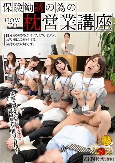
A harsh economy calls for dire measures to sell insurance in this zany world JAV release by V&R.
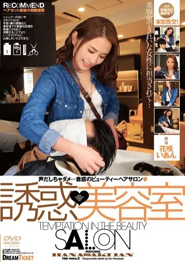
Beautiful Japanese hair stylist Ian Hanasaki finds herself sexually frustrated and horny on the clock in this risky exposure title by DREAM TICKET.
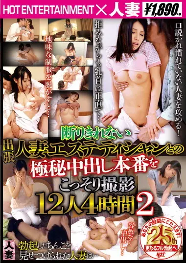
More massages gone totally off the charts via HOT ENTERTAINMENT as and married masseuses end up having sex with their clients who cum inside them.
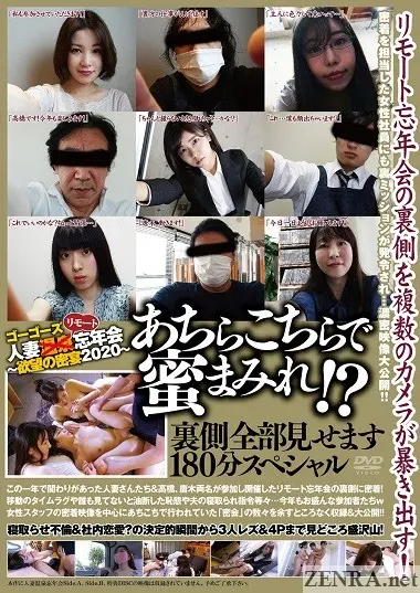
A new hire is tasked with seeing how COVID has affected shooting of what should be a joyous group affair. Hint: contains lots of unfaithful sex!

Now let's discuss the elements of anal that make it distasteful!
July 15th, 2026

Find out why most fans had their mouth wide open after finding out about Ren's crazy transformation. We've the deets. Take a deep dive!
July 15th, 2026

Check out the hottest and rising stars in JAV right now. See why fans are going gaga for one actress’s unbelievably large areolas.
July 14th, 2026
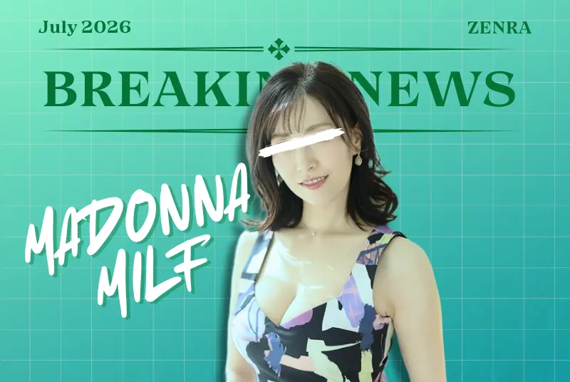
Find out about this renowned MILF actress who has created a stir after making a comeback with DAHLIA. We've the deets. Take a deep dive!
July 14th, 2026

Join me as I take a look at my personal top five favorite JAV actresses from the first half of the year.
July 13th, 2026
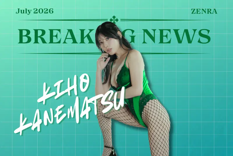
From Ai Mukai announcing her comeback to Kiho facing a jumpscare moment before TRE, we've the deets. Take a deep dive!
July 12th, 2026
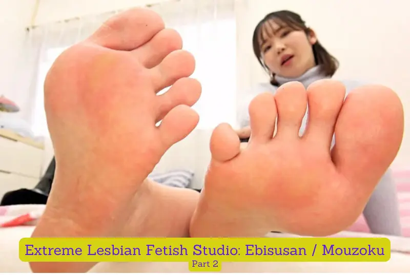
More from the iconic EVIS studio, this time we get even MORE freaky with these lesbian fetishes!
July 11th, 2026
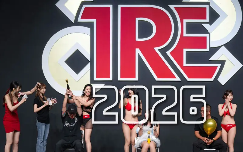
The Taipei Red Expo aka TRE is back to bring the biggest JAV fan event of the year. See the sights, the ladies, and the fans that attended.
July 10th, 2026
Sometimes you're a stud and other times you're a dud. Read on to see what films were the biggest letdowns of the year so far.
July 9th, 2026

By Fried Chikan @ October 13th, 2023


By RamenBoss @ February 28th, 2021